Heatmaps
State of the R
24-28/08/2020
On génère une matrice à visualiser.
n <- 40
m <- 40
Q <- 3
L <- 2
alpha <- c(0.3, 0.3, 0.4)
beta <- c(0.4, 0.6)
lambda <- matrix(c(13, 21, 1, 25, 3, 16), nrow=Q, ncol=L)
z <- matrix(0, nrow=n, ncol=Q)
w <- matrix(0, nrow=m, ncol=L)
x <- matrix(0, nrow=n, ncol=m)
rownames(x) <- paste0("X", 1:nrow(x))
colnames(x) <- paste0("Y", 1:ncol(x))
z[cbind(1:n, sort(sample(Q, n, replace=TRUE, prob=alpha)))] <- 1
w[cbind(1:m, sort(sample(L, m, replace=TRUE, prob=beta)))] <- 1
a <- z%*%lambda%*%t(w)
x <- apply(z%*%lambda%*%t(w), c(1,2), FUN=function(x) rpois(1,x))
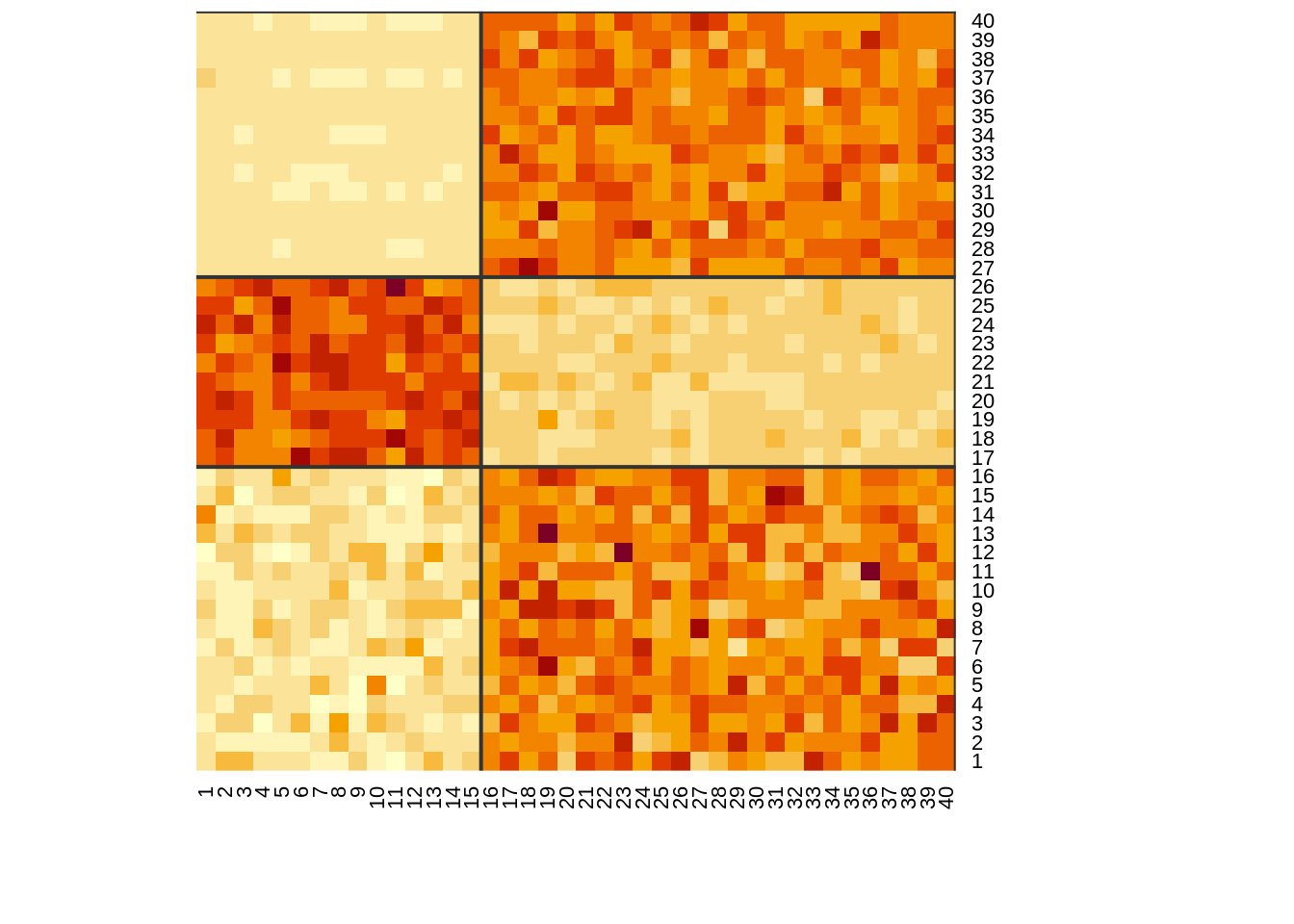
heatmap(x,
Colv=NA,
Rowv=NA,
add.expr = c(
abline(h = cumsum(colSums(z)) + 0.5, col = "grey20", lwd = 2),
abline(v = cumsum(colSums(w)) + 0.5, col = "grey20", lwd = 2)
),
col=hcl.colors(12, "YlOrRd", rev = TRUE)
)
Visualisations alternatives
image.plot (fields)
fields::image.plot(1:n, 1:m, t(x),
           col = c(hcl.colors(12, "YlOrRd", rev = TRUE)),
           xlab = "", ylab = "", axes = FALSE, zlim = c(min(x), max(x))
)
abline(h = cumsum(colSums(z)) + 0.5, col = "grey20", lwd = 2)
abline(v = cumsum(colSums(w)) + 0.5, col = "grey20", lwd = 2)
axis(BELOW <- 1, at = 1:n, labels = as.factor(as.character(rownames(x))), las = 2, cex.axis = 0.6)
axis(LEFT <- 2, at = 1:m, labels = as.factor(as.character(colnames(x))), las = 2, cex.axis = 0.6)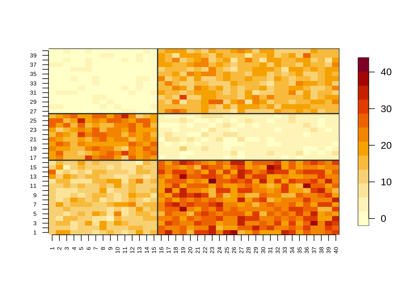
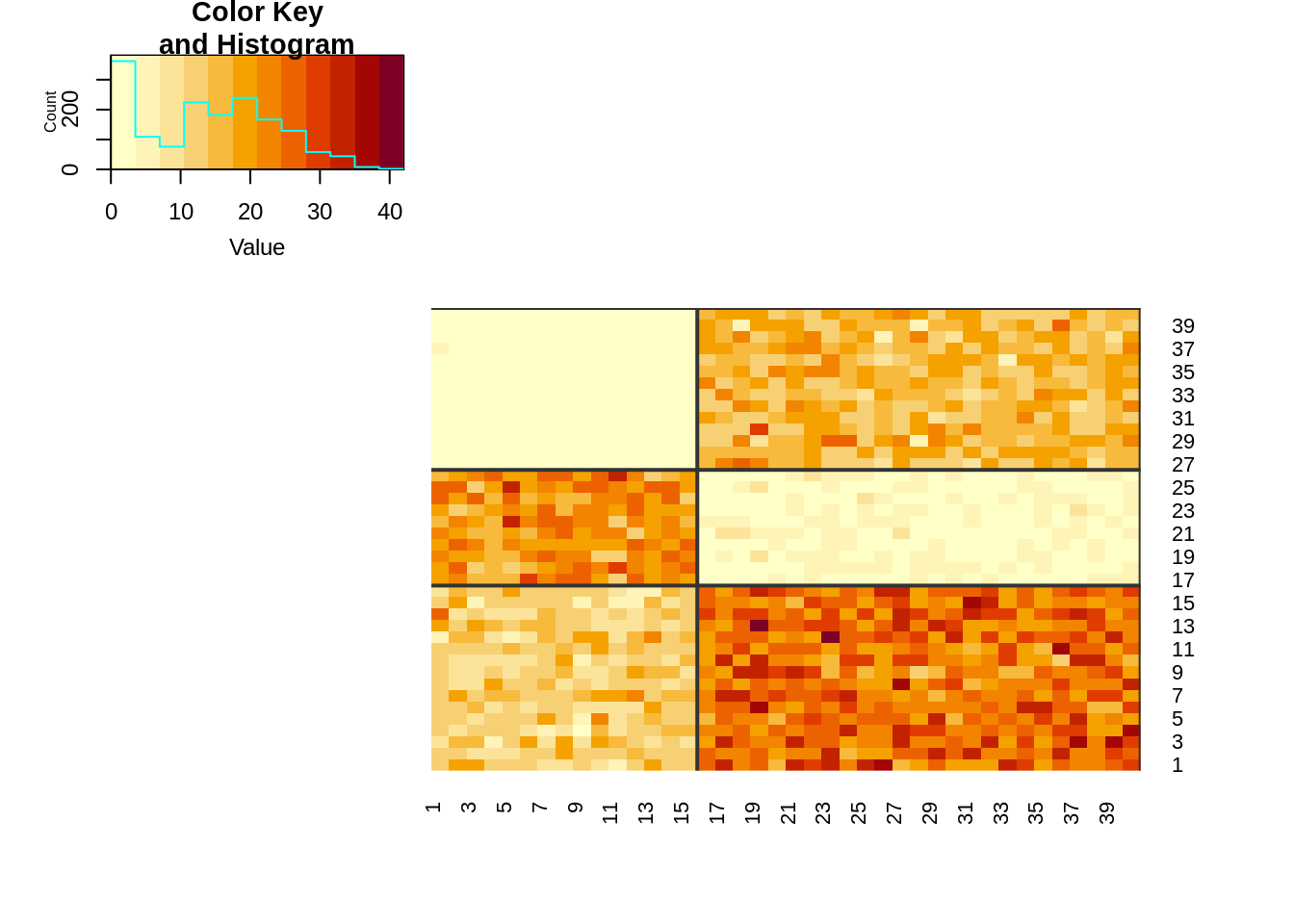
heatmap.2 (gplots)
gplots::heatmap.2(x,
          Colv=FALSE,
          Rowv=FALSE,
          dendrogram="none",
          trace="none",
          add.expr=c(
            abline(h = cumsum(colSums(z)) + 0.5, col = "grey20", lwd = 2),
            abline(v = cumsum(colSums(w)) + 0.5, col = "grey20", lwd = 2)
          ),
          margins=c(5,5),
          key = TRUE,
          keysize = 2,
          revC=TRUE,
          col=hcl.colors(12, "YlOrRd", rev = TRUE)
)
ggplot2
indices <- which(x > 0)
min <- min(x)
max <- max(x)
dfx <- reshape2::melt(x)

fig1 <- ggplot(dfx, aes(x=Var2, y=Var1, fill=value)) +
  geom_tile() +
  scale_fill_distiller(palette = "YlOrRd", direction = 1) +
  theme(axis.text.x = element_text(size=rel(1), angle=90),
        axis.text.y = element_text(size=rel(1))
  ) +
  geom_vline(xintercept = cumsum(colSums(w)) + 0.5) +
  geom_hline(yintercept = cumsum(colSums(z)) + 0.5)

fig1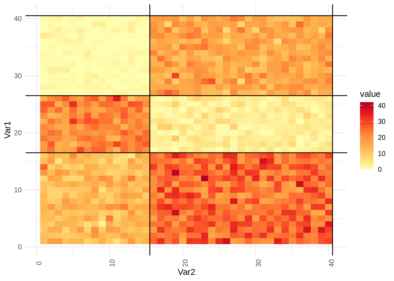
ggplotly
ggplotly(fig1)plotly
plotly_shapes <- NULL
for (i in cumsum(colSums(z))) {
  plotly_shapes <- c(plotly_shapes, list(list(type = "line",
                                              line = list(color = "black"), opacity = 0.8,
                                              x0 = 0.5, x1 = m+0.5, xref = "x",
                                              y0 = i + 0.5, y1 = i + 0.5, yref = "y")))
}
for (i in cumsum(colSums(w))) {
  plotly_shapes <- c(plotly_shapes, list(list(type = "line",
                                              line = list(color = "black"), opacity = 0.8,
                                              x0 = i+0.5, x1 = i+0.5, xref = "x",
                                              y0 = +0.5, y1 = n+0.5, yref = "y")))
}
plot_ly(dfx, x=~Var2, y=~Var1, z=~value) %>%
  add_heatmap(colors = "YlOrRd") %>%
  colorbar(title = "value") %>%
  layout(shapes = plotly_shapes)
d3heatmap
d3heatmap(x, Rowv = FALSE, Colv = FALSE, colors = "YlOrRd")Heatmap à partir d’une image
url <- "https://images.plot.ly/plotly-documentation/images/heatmap-galaxy.jpg"
tmpf <- tempfile()
download.file(url,tmpf,mode="wb")
data <- readJPEG(tmpf)
fr <- file.remove(tmpf)

zdata = rowSums(data*255, dims = 2)

fig <- plot_ly(
  z = zdata,
  colorscale = list(c(0,0.5,1),c("blue", "white", "red")),
  type = "heatmapgl"
)

fig
Bonus
Histogrammes
hist1 <- ggplot(dfx, aes(x=value)) +
  geom_histogram(binwidth=1, color="black", fill="orange")

ggplotly(hist1)
hist2 <- plot_ly(dfx,
x = ~value,
type = "histogram",
marker = list(color = "orange",
line = list(color = "black",width = 2)
)
)
hist2